Friday, 25 October 2013

Flowers


Flowers! Now that spring is in season, there's no better way to celebrate than to decorate your living and work space with blooms! Think big, think colourful, think smelly, anything goes! Do you prefer small, pale flowers in bunches, or big, bring bulbs? Here's a few suggestions for arrangements


Small and Pretty
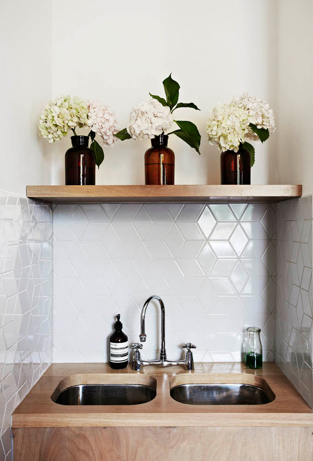
Small, delicate flowers are timeless and always look best in bunches. The beauty with pastel and white flowers is that they can be put in ornate vases and look formal or in simple, glass jars, giving them a slight vintage look. Place these florwers in an entrance hall, or on a cabinet.
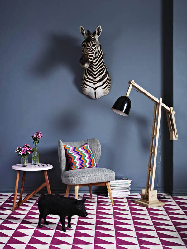


 Vibrant, yet simple
 Vibrant flowers are stunning, however it usually the case that less is more, whether that be for size or colour. These flowers look best in plain or clear vases, giving emphasis to the colour.
Photo Courtesy of DesignSponge

This beautiful, big bunch of flowers works because of the use of one colour, and its varying tones.


Think outside the Vase
Change it up a bit! Instead of using typical vases, use a box, a jar, a an old perfume bottle, the list is endless. Hang the flowers from the roof, off a door, or simply place a bouquet on the table. And whilst you're there, why not skip the traditional flower all together and display other weird and wonderful flora.
Vegetable Display

Wednesday, 23 October 2013

Get a Job!

Ah, the infamous sentence, 'get a job'. Easier said than done, of course. I should know, I've been trying. But then again, it is partially my fault, due to the fact that I'm trying to get a job in Design, for which there isn't high demand in this current economy...but I digress. Jobs, jobs, jobs! If I had my way, I would write this blog as a job. I'd travel the world, watch shows, eat food and mingle, all in the name of my little blog. I'd be paid a neat fee to interview the successful, to write about how orange is the new black, and fly above the clouds to new places, new smells. If I had my way...

...I'd be rubbing shoulders with Tavi Gevinson and being the guest writer on The Design Files. I would have a major influence on the colours and patterns for major furniture designers, and be interviewed by Vogue Living.

Instead, I'm shouting "give me a job!" to design firms from the comfort of my bed. All the while, I'm writing a blog, dreaming starry eyed, about the day people ask to work for me, the day designers feel that they've reached success because they've been mentioned on my blog. Dreaming of conquering the world, whilst wearing my pyjamas...


Tuesday, 22 October 2013

Hello!

Today, I'm absolutely loving the new wallpaper Production Picks by Florence Broadhurst at The Elephant Room in Melbourne, featuring beautiful custom coloured, hand printed wallpaper options now available for order. Many of the designs haven't been seen by the public for many years!

Japanese Floral FBW-CU19231
 
Imperial Brocade FBW-CU10002


Florence Maud Broadhurst, for those who haven't heard of her, was an Australian designer and businesswoman. Born in Queensland in 1899, she led an interesting life, trotting the globe, establishing the Broadhurst Academy in Shanghai, marrying a stockbroker and exhibiting her landscape paintings in Sydney.

Florence sits in her Paddington studio in front of one of her 800 designs
In 1959, Broadhurst established the Australian (Hand Printed) Wallpapers Pty Ltd, which would later become Florence Broadhurst Wallpapers Pty Ltd. At the time, it was advertised as "the only studio of its kind in the world", with her brightly coloured geometric and nature-inspired over-sized wallpaper designs all hand printed.

 Advances in technology made in her studio enabled printing onto metallic surfaces, washable, vinyl-coating finish and a drying rack system that allowed her wallpapers to be produced in large qualities. 


By 1972, her wallpaper ranged from around 800 designs in 80 different colours, and exporting her goods worldwide. However, in 1977, Broadhurst was found murdered in her Paddington studio. The murder was never solved. To this day, Florence Broadhurst is still known for her brilliantly creative and boldly coloured designs, ranging from peach peacocks to art deco cubes, and remains an inspiration to aspiring designers everywhere.

 
Cockatoos FBW-CU14943

Monday, 21 October 2013

What Makes a Room?


What makes a room? What makes a room yours? What is it about our bedrooms that lifts the world off of our shoulders and comforts us like a blanket on a rainy night? What makes it personal?
Is it the colour? The style? How about the furniture?

Well, yes, all of the above, but, there is more to it. Look at your bedside table. Is there a book? Maybe more than one. Maybe a few. A clock, a watch and most likely a phone? Look at your chest-of-drawers. Are there some perfume bottles? An old vase from your grandmother, a candle and a pair of earrings you've had for years. 
Image Courtesy of Domino Mag
Do you ever get that feeling when you walk into someone's house for the first time, where it's as though you're suddenly seeing a different side to the person who lives there? Sometimes, a person's home is just like their clothing, almost a costume; the cover of a book that just won't budge. Other times, it's as though you're walking right into the person's very personality, their life bared to you on every wall, like a story. The pictures, flowers, bits and bobs that whisper of stories and adventure.

All these little things, these tiny things that make up the big picture of who we are. It's amazing how important but seemingly insignificant these little decorations can seem, and although we shouldn't hold such emotion to material value, we are constantly surrounded by these little things that make up our lives, often helping us shape who we are and remind us of where we want to be.

Image Courtesy of  decoratorsnotebook.co.uk


A Mixture of Old and New

Hello fellow design lovers and morning procrastinators,

Now imagine a lounge, painted white, with an purple, velveteen lounge situated in the middle of the feature wall. A contrast of stark white and shifting purple. A modern geometric chair there, and a classic, gigantic baroque picture frame there. Old meets new. It's the latest trend in Interior Design, giving life to the furniture and trinkets of old, whilst allowing for new, hard-lined furniture to gain some spotlight. It's a trend that I hope stays a while yet, simply because it's rather spectacular when done correctly, it requires little effort, and I absolutely love it! There are, of course, particular guidelines to creating a successful room in this fashion, so I thought I'd share some fine examples of a somewhat timeless style, with hints along the way.


Pattern and Texture

Colour and pattern play a rather large role in this fashion, with many of the shapes and colours in current fabric design being quite contrary to that from 30-50 years ago. Geometric diamonds, circles and random animals are popular now, whilst it used to be detailed flowers and pictures. We're far more interested in organic cotton and hemp now, with their slightly rough, yet organic feel, as opposed to the indulgent luxurious textures of velvet and silk from back in the day. However, when mixed together in just the right way, these textiles can look fabulous.

Image courtesy of Tumblr
  A key ingredient to this rather eye-catching room, is the mixture of patterns and texture. The look is achieved by mixing similar colours with a white wall, allowing the room to breath, and not look too overbearing. The beautiful monochrome cushions and rug compliment the lampshade and chandelier, whilst creating a subtle and attractive contrast with the armchair.

Image Courtesy of maggieoverbystudios.com
Image Courtesy of DesignSponge

Artwork

Never underestimate the power of well-placed art. A modern art piece, placed with interesting furniture, or vice-verse, creates a fantastic focal point in a room. And remember; Symmetry is key.

Photos from Australian Vogue Living and French AD


Colour

In my humble opinion, colour is often used too generously. If you want a room that really strikes the eye, then monochrome with a just a splash of colour, is the way to go. An overly colourful and bright room ages quite quickly, and it rather hurts your eyes, so sometimes simple colour and strategic lighting is all that is needed to boost a space. Black, white, grey and the like, aren't gloomy, it's just a matter of using them correctly for each individual room, and experimenting with what particular colour best suits. 
 
A simple, white room, with small, bold pops of colour is striking and plenty of sunlight makes the space feel fresh.
Classic white, grey and black, with brown wood details, creates a modern, yet comfortable room

Monochrome white, with just two pops of colour. Eye-catching
 However, if you love to use colour, then go for it! The best way to create an aesthetically pleasing, colourful room, is to stick to a colour palette. Too many contrasting colours is often the downfall of a colourful room, so perhaps choose two colours, and then work around their respective shades and tones. 
                      A lovely, colourful corner, consisting of warm tones and neutral shades.                                   


Whilst there are many more little details that make a space truly unique, these are the basic three. However, some small side notes:
  • The most successful space are those filled with items that have meaning
  •  Be confident in your abilities and trust your instincts
  • Lighting is most often quite crucial in bringing a room together
  • Be daring! Don't just follow the rules! Half the time, they can be broken with success, so long as you have the confidence to pull it off

I hope you enjoyed!

Thursday, 17 October 2013

Do Not Go Gentle Into That Good Night

Do Not Go Gentle Into That Good Night
                 By Dylan Thomas 

Do not go gentle into that good night,
Old age should burn and rave at close of day;
Rage, rage against the dying of the light.

Though wise men at their end know dark is right,
Because their words had forked no lightning they
So not go gentle into that good night.

Good men, the last wave, by crying how bright
Their frail deeds might have danced in a green bay,
Rage, rage against the dying of the light.

Wild men who caught and sang the sun in flight,
And learn, too late, they grieved it on its way,
Do not go gentle into that good night.

Grave men, near death, who see with blinding sight
Blind eyes could blaze like meteors and be gay,
Rage, rage against the dying of the light.

And you, my father, there on the sad height,
Curse, bless, me now with your fierce tears, I pray.
Rage, rage against the dying of the light.

Wednesday, 16 October 2013

Doctor Who. Recently started watching it. Can't stop watching it. I've spent the last two days just watching it. Main reason? Space. Space and time travel. Who could resist the opportunity to dance beside Marie Antoinette? Watch Julius Caesar's army cross the Rubicon? See the great pyramids in their prime? Has it not been the dream of humanity to walk through history, to witness the events that shaped the world to be what it is today, to observe some of the greatest mysteries on Earth. Watch the assassination of Lincoln and be home in time for tea, spend your summer break watching the construction of Stone Henge.


Yes, please