Hello fellow design lovers and morning procrastinators,
Now imagine a lounge, painted white, with an purple, velveteen lounge situated in the middle of the feature wall. A contrast of stark white and shifting purple. A modern geometric chair there, and a classic, gigantic baroque picture frame there. Old meets new. It's the latest trend in Interior Design, giving life to the furniture and trinkets of old, whilst allowing for new, hard-lined furniture to gain some spotlight. It's a trend that I hope stays a while yet, simply because it's rather spectacular when done correctly, it requires little effort, and I absolutely love it! There are, of course, particular guidelines to creating a successful room in this fashion, so I thought I'd share some fine examples of a somewhat timeless style, with hints along the way.
Pattern and Texture
Colour and pattern play a rather large role in this fashion, with many of the shapes and colours in current fabric design being quite contrary to that from 30-50 years ago. Geometric diamonds, circles and random animals are popular now, whilst it used to be detailed flowers and pictures. We're far more interested in organic cotton and hemp now, with their slightly rough, yet organic feel, as opposed to the indulgent luxurious textures of velvet and silk from back in the day. However, when mixed together in just the right way, these textiles can look fabulous.
 |
| Image courtesy of Tumblr |
A key ingredient to this rather eye-catching room, is the mixture
of patterns and texture. The look is achieved by mixing similar colours
with a white wall, allowing the room to breath, and not look too
overbearing. The beautiful monochrome cushions and rug compliment the
lampshade and chandelier, whilst creating a subtle and attractive
contrast with the armchair.
 |
| Image Courtesy of maggieoverbystudios.com |
 |
| Image Courtesy of DesignSponge |
Artwork
Never underestimate the power of well-placed art. A modern art piece, placed with interesting furniture, or vice-verse, creates a fantastic focal point in a room. And remember; Symmetry is key.
Photos from Australian Vogue Living and French AD
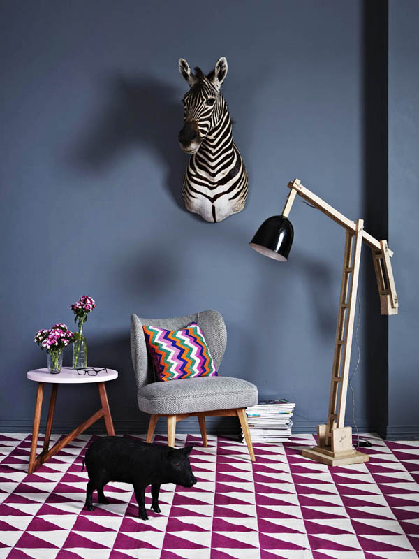
Colour
In my humble opinion, colour is often used too generously. If you want a room that really strikes the eye, then monochrome with a just a splash of colour, is the way to go. An overly colourful and bright room ages quite quickly, and it rather hurts your eyes, so sometimes simple colour and strategic lighting is all that is needed to boost a space. Black, white, grey and the like, aren't gloomy, it's just a matter of using them correctly for each individual room, and experimenting with what particular colour best suits.
 |
| A simple, white room, with small, bold pops of colour is striking and plenty of sunlight makes the space feel fresh. |
 |
| Classic white, grey and black, with brown wood details, creates a modern, yet comfortable room |
 |
| Monochrome white, with just two pops of colour. Eye-catching |
However, if you love to use colour, then go for it! The best way to create an aesthetically pleasing, colourful room, is to stick to a colour palette. Too many contrasting colours is often the downfall of a colourful room, so perhaps choose two colours, and then work around their respective shades and tones.
 |
| A lovely, colourful corner, consisting of warm tones and neutral shades. |
|
|
|
|
|
Whilst there are many more little details that make a space truly unique, these are the basic three. However, some small side notes:
- The most successful space are those filled with items that have meaning
- Be confident in your abilities and trust your instincts
- Lighting is most often quite crucial in bringing a room together
- Be daring! Don't just follow the rules! Half the time, they can be broken with success, so long as you have the confidence to pull it off
I hope you enjoyed!


No comments:
Post a Comment